Code like song
Fonts, Credibility, and "Statistically Significant"
Yesterday I came across a New York Times blog by Errol Morris describing an experiment showing that some fonts are more credible than others (Hacker News discussion here). That is, if some people read a claim written in Baskerville, and some other people read the same claim written in Comic Sans, more people will believe the Baskerville version.
Morris conducted this experiment by asking people in a previous blog post whether they agreed or disagreed with a statement about modern safety. He showed the poll in one of six different fonts, randomly selected for each visitor. The poll asked if you agreed or disagreed, then asked whether your agreement or disagreement was weak, moderate, or strong. In yesterday’s post, Morris described his results.
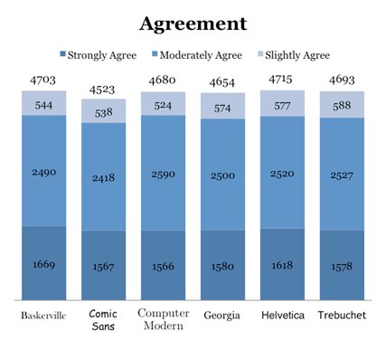
There are several complaints made in the HN thread about Morris’s deceptive graphics. His stacked bar charts for Agreement and Disagreement show absolute counts, even though each font was shown a different number of times. So despite Computer Modern’s higher percentage of agreement, Baskerville has a higher bar because it was shown more often.
Also, his chart showing weighted agreement exaggerates the difference between each font. Notice that the bars don’t start at zero:
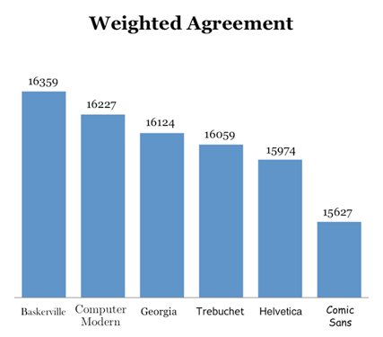
These are both classic sins against data visualization. Edward Tufte would be sad.
My interest, however, was not in the poor graphics, but in the statistics. Morris wanted to know whether his results were “statistically significant.” Having used statistics at ElectNext and again at Socialyzer, I’m very interested in this idea of “statistically significant.” I’m not a statistician, but I’m trying to learn more about the field, both traditional (“frequentist”) statistics, and Bayesian. One thing I’m trying to understand is this idea of “statistically significant.” And what I’ve learned so far is that it’s not simple.
Frequentist statistics offers a couple precise ways to define “statistically significant.” One is via a confidence interval. Once we’ve taken a sample and found its mean, we want to know if our experiment is representative of the overall population. A confidence level C, paired with a margin of error E, says that the overall mean of the population is C% likely to be within +/-E of the mean we observed. That’s what the “+/-3%” means when you see opinion polls in the media. By convention, those polls report the margin of error at a 95% confidence level.
The other technique is to find a p-value. Essentially, the p-value is the probability that your observation is the result of chance and not representative of the overall population. To find a p-value, you state a “null hypothesis” and an “alternate hypothesis.” The null hypothesis is what you expect to disprove, so it usually is something like “there is no effect” or “Baskerville is equally as credible as Comic Sans.” Then you compute the p-value for your null hypothesis. A low p-value suggests that the null hypothesis is false and your alternative hypothesis is true. (Yes, it all feels very backward.)
To write the article, Morris contacted Professor David Dunning at Cornell. Unfortunately, in reporting Dunning’s analysis, Morris loses quite a bit in translation:
Are the results the product of chance? To address this question, Dunning calculated the p-value for each font. Grossly simplified, the p-value is an assessment of the likelihood that the particular effect we are looking at (e.g., the effect produced by Baskerville) is a result of a meaningless coincidence. The p-value for Baskerville is 0.0068. Dunning explained, “We never completely rule out random chance as a possible cause of any result we see. But sometimes the result is so strong that chance is just very, very unlikely. What’s strong enough? If the p-value is 0.05 or less, we typically dismiss chance as an explanation by ‘industry agreement.’ That is, we tolerate a 5 percent chance on any one comparison that what we are looking at is merely random variation.” But Dunning went even further. Since we are testing six fonts, he noted that there “are 6, not 1, opportunities for me to be just looking at random chance. The conservative approach is to divide 5 percent by the number of tests. Thus, the p-value to dismiss chance falls to 0.0083.” Under 1 percent.
In my opinion, this paragraph does in words what Morris’s graphs do with pictures. There aren’t any lies, but there is a semblance of meaning masking confusion, and a tone that suggests the opposite of the truth. First, “The p-value for Baskerville is 0.0068,” doesn’t make a lot of sense. What was the null hypothesis? It’s like saying, “My car is 25% faster.” Faster than what? This is supposed to sound like statistics, but it’s actually gibberish. I don’t doubt that Dunning made a real analysis, but Morris clearly doesn’t expect us to comprehend this number. It appears he doesn’t comprehend it himself. It’s just there to impress us. So below I will try to reconstruct what this is all about, and find my own p-value.
Second, the tone in the latter half of that paragraph sounds as if the 0.0068 result is even more impressive once we consider that there are 6 fonts. But in fact it’s just the opposite. Baskerville’s p-value of 0.0068 (whatever that means) is very significant if the usual cutoff is 0.05. But now Morris tells us that with 6 fonts, a result is only significant if the p-value is below 0.0083. So although his result is significant, it isn’t by much. Once again I get the impression that Morris has no idea what Dunning is telling him, but he puts the numbers into his narrative and plows ahead.
So let’s dig into this p-value, and see for ourselves how significant Morris’s result is. I created a Github project to analyze the font credibility experiment. There you can find Morris’s data and some R commands I used to explore it. Here I’ll walk through those commands. First, I transcribed the raw data in a tab-delimited text file:
| font | sd | md | wd | wa | ma | sa |
| Baskerville | 985 | 1460 | 388 | 544 | 2490 | 1669 |
| Comic Sans | 1045 | 1547 | 392 | 538 | 2418 | 1567 |
| Computer Modern | 1007 | 1460 | 330 | 524 | 2590 | 1566 |
| Georgia | 1101 | 1520 | 374 | 574 | 2500 | 1580 |
| Helvetica | 1066 | 1537 | 381 | 577 | 2520 | 1618 |
| Trebuchet | 1062 | 1541 | 360 | 588 | 2527 | 1578 |
Then I wrote a Ruby script to munge this data into something that R would like, with one row for every person who took the poll:
puts "font\tscore"

$stdin.readlines.each_with_index do |line, i|
  if i > 0
    line.chomp!
    font, sd, md, wd, wa, ma, sa = line.split "\t"
    $stderr.puts "#{font}:\t#{[sd, md, wd, wa, ma, sa].join("\t")}"
    [sd, md, wd, wa, ma, sa].each_with_index do |amt, score|
      amt.to_i.times do |j|
        puts [font, score].join("\t")
      end
    end
  end
end
This gives you a file with about 45,000 rows like this:
| font | score |
| Baskerville | 0 |
| Baskerville | 0 |
| Baskerville | 0 |
| Baskerville | 0 |
| . . . | |
| Trebuchet | 5 |
Here we are encoding the different levels of agreement with the numbers 0 to 5, from Strongly Disagree to Strongly Agree. I called this file ad for “agree/disagree.”
In R, I imported the data like this:
> data = read.delim('ad', header=T)
> attach(data)
> b = font=='Baskerville'
> cs = font=='Comic Sans'
It’s easy to transform the data to a binary Agree/Disagree response or to the weighted scale Morris describes (-5, -3, -1, 1, 3, 5). For instance, here is the mean for Baskerville if all Agree responses are 1 and all Disagrees are 0:
> mean(score[b] >= 3)
[1] 0.6240711
And here is the mean using Morris’s weighted scale:
> mean(score[b] * 2 - 5)
[1] 0.8845541
We can also use tapply to find the mean for all fonts with either the [0, 1] or the [-5, 5] scale:
> tapply(score >= 3, font, mean)
Baskerville      Comic Sans Computer Modern         Georgia       Helvetica
  0.6240711       0.6025043       0.6259195       0.6084455       0.6124172
  Trebuchet
  0.6129833
> tapply(score * 2 - 5, font, mean)
Baskerville      Comic Sans Computer Modern         Georgia       Helvetica
  0.8845541       0.7151991       0.8531497       0.7236240       0.7669827
  Trebuchet
  0.7531348
In both cases, Baskerville scores higher than Comic Sans. The question is, did this happen by chance or by some underlying factor? Our null hypothesis is that Baskerville really has the same credibility as Comic Sans. Comparing two samples like this is called a “two-sample t-test.” The formulas to get the p-value from such a test are complicated, but R makes it easy:
> t.test(score[b|cs] >= 3 ~ font[b|cs])

  Welch Two Sample t-test

data:  score[b | cs] >= 3 by font[b | cs]
t = 2.7162, df = 15037.98, p-value = 0.00661
alternative hypothesis: true difference in means is not equal to 0
95 percent confidence interval:
 0.006003577 0.037130015
sample estimates:
mean in group Baskerville  mean in group Comic Sans
                0.6240711                 0.6025043
This result is a “Welch” t-test, considered to be more conservative than a “Classic” t-test. But we can run the classic version, too:
> t.test(score[b|cs] >= 3 ~ font[b|cs], var.equal=T)

  Two Sample t-test

data:  score[b | cs] >= 3 by font[b | cs]
t = 2.7163, df = 15041, p-value = 0.006609
alternative hypothesis: true difference in means is not equal to 0
95 percent confidence interval:
 0.006003886 0.037129706
sample estimates:
mean in group Baskerville  mean in group Comic Sans
                0.6240711                 0.6025043
Both tests give us roughly the same p-value: 0.00661. That number is indeed less than the conventional 0.05 required for “significance,” and is also lower than Dunning’s 0.05/6, or 0.0083.
We also get a strong p-value when we use the weighted scale:
> t.test(score[b|cs] * 2 - 5 ~ font[b|cs])

  Welch Two Sample t-test

data:  score[b | cs] * 2 - 5 by font[b | cs]
t = 2.8843, df = 15038.97, p-value = 0.003929
alternative hypothesis: true difference in means is not equal to 0
95 percent confidence interval:
 0.05426331 0.28444668
sample estimates:
mean in group Baskerville  mean in group Comic Sans
                0.8845541                 0.7151991
This time it’s 0.003929: also significant. The p-value for a Classic t-test is similar.
But our numbers still don’t agree with Dunning’s. Why is that? I’m not sure, but one possible reason is a difference in how we computed the standard deviation. R computes standard deviation like this:
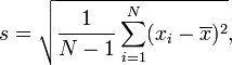
but some people compute it like this:
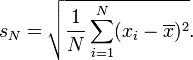
(Formulas from Wikipedia.) This could have an effect because standard deviation is one of the values used to compute a p-value. Or (more likely) Dunning could just be running a different test than me.
Anyway, my result basically agrees with Morris’s: the difference appears to be significant. One caveat he doesn’t mention is that any difference can be significant with a large enough sample size. The question is whether the difference is large enough that we care. The observed difference of roughly 2% (mean(score[b] >= 3) - mean(score[cs] >= 3)) is indeed worthwhile from an online marketing standpoint, but our t-test didn’t tell us that the difference is really 2%. All we’ve proved is that the null hypothesis is (probably) not true. We haven’t proved that the difference between Baskerville and Comic Sans is as large as our sample shows. The true difference could be much smaller. But Morris doesn’t tell us that. His article suggests that the p-value proves a 2% difference.
I suppose we could keep running t-tests where the null hypothesis changes from “Baskerville is the same as Comic Sans” to “Baskerville is 0.5 points better than Comic Sans” to “Baskerville is 1 point better than Comic Sans,” and get a range of probabilities. But a probability distribution like that seems more like a Bayesian outcome; I’ve never heard of such a thing in frequentist statistics. I don’t know why it couldn’t be done, though. It seems like you sould even be able to so some calculus to work from the p-value formula to such a curve.
The thing that makes me most uneasy about this whole p-value analysis is that neither the weighted nor unweighted scores follow a normal curve. The unweighted values are only “Agree” and “Disagree,” so a normal curve is impossible. The weighted data has 6 options, but all the fonts have something like an inverse normal curve: most of the answers are at the extremes, with a low in the middle. With such a curve shape, I’m skeptical whether the logic behind p-values is still coherent. I would love to ask a good statistician.
UPDATE: I found a StackExchange discussion about running a t-test on a non-normal distribution: A t-test does not require a normally-distributed sample. It only assumes that if you run multiple samples and collect all their means, then those means will follow a normal distribution. This is provably guaranteed if your samples are large, due to the Central Limit Theorem. This is exactly the answer I was hoping for. Also, if you follow the StackExchange link, you’ll learn that computers have made feasible some more modern approaches that give better results than t-tests.
blog comments powered by Disqus Prev: Rails has_many :through with Checkboxes Next: Git: Compare two branches

Code
Writing

Talks

- Temporal Benchmark
- Inlining Postgres Functions
- Temporal Databases 2024
- Papers We Love: Temporal Alignment
- Benchbase for Postgres Temporal Foreign Keys
- Hacking Postgres: the Exec Phase
- Progress Adding SQL:2011 Valid Time to Postgres
- Temporal Databases: Theory and Postgres
- A Rails Timezone Strategy
- Rails and SQL
- Async Programming in iOS
- Errors in Node.js
- Wharton Web Intro
- PennApps jQuery Intro